

Polpo — Restaurant Concept
A seaside seafood restaurant identity concept bringing the culture of Cinque Terre to Malta. An octopus character, script lettering and nautical details connect the restaurant’s signature dish with its coastal story.
- Services
- Brand Identity / Logo Design / Illustration
- Year
- 2025
The restaurant concept
The concept follows a couple from Cinque Terre opening a restaurant by the sea in Malta. They bring their home culture and food traditions to a seafood-focused menu, blending them with Maltese culture and cuisine. Octopus is the restaurant’s signature dish.
The branding challenge
The brief brings together the founders’ Cinque Terre roots, a Maltese seaside setting and a seafood menu centred on octopus. The design needed to connect these parts of the restaurant story in one recognisable identity. The octopus character gives the signature dish a central role, while the script lettering and nautical details support its coastal personality.
The design direction
The identity brings together the restaurant’s Cinque Terre roots and its Maltese seaside setting through a warm coastal character. Nautical details, expressive script lettering and an illustrated octopus give the concept a welcoming personality, with the signature dish at the centre of the visual story.
Logo & character
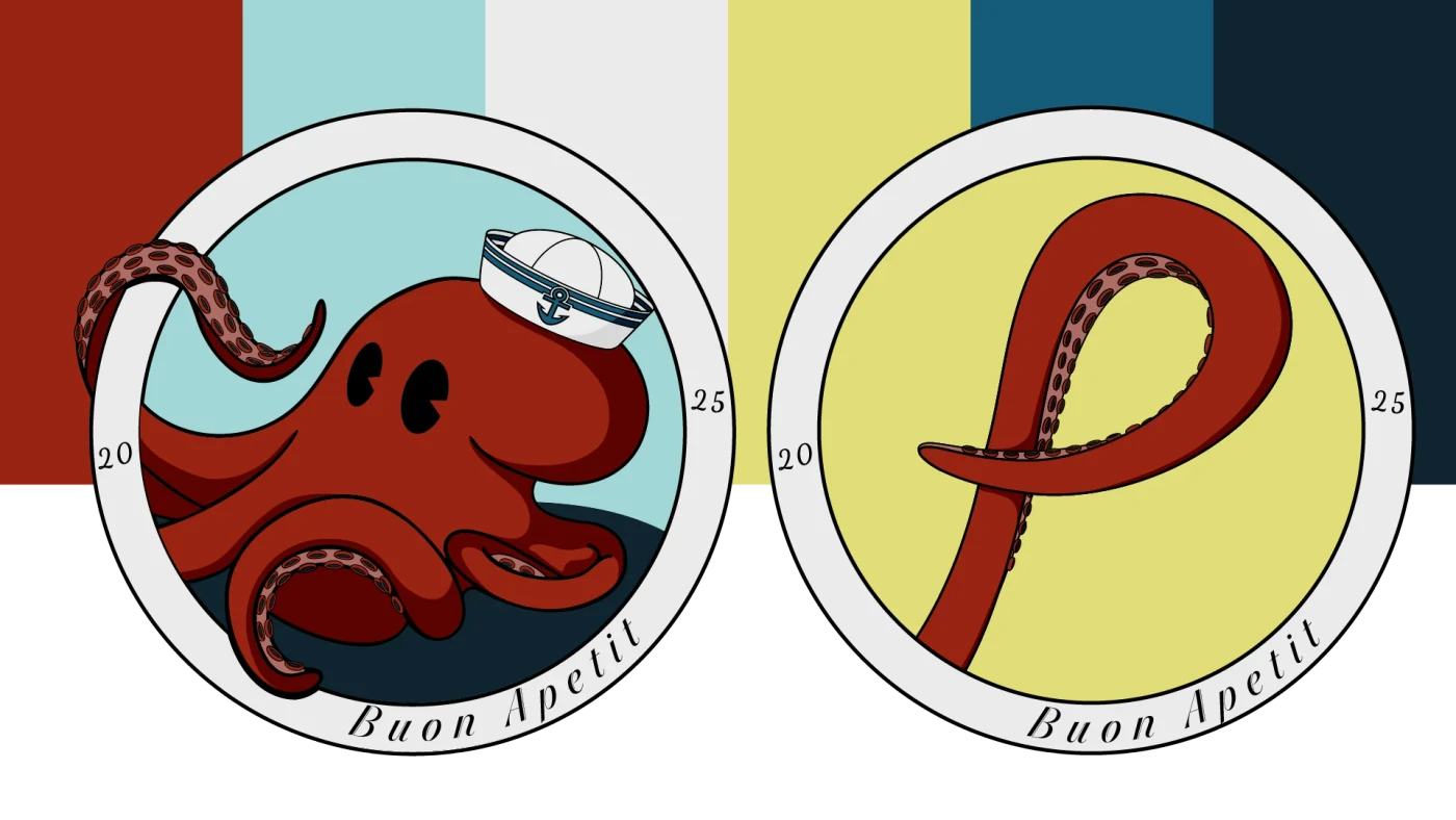
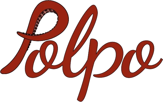
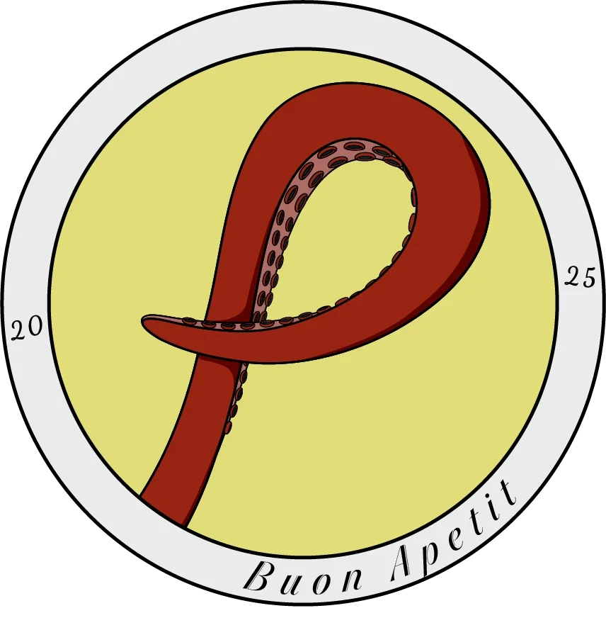
The octopus character gives the restaurant’s signature dish a recognisable face, while its sailor hat connects the illustration to the seaside setting. The Dancing Script wordmark and a tentacle-inspired P badge carry this character across different parts of the identity.

Supporting marks & pattern
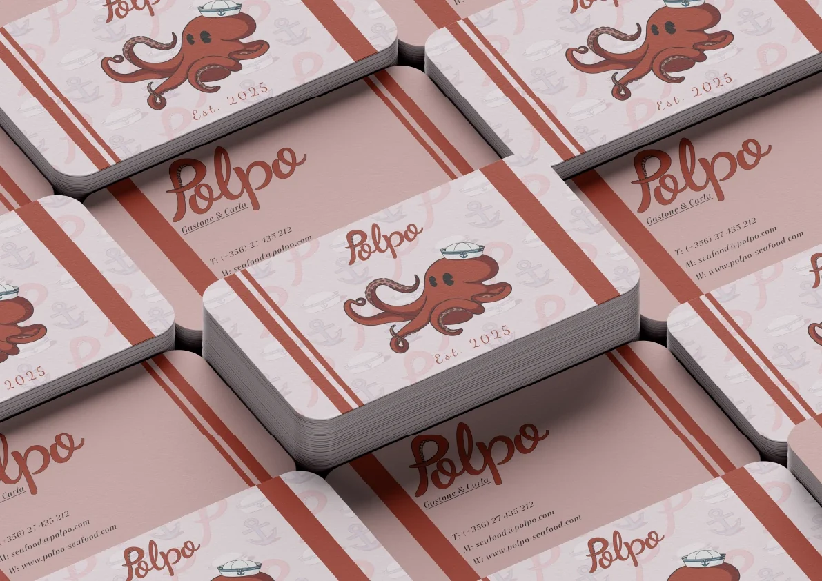
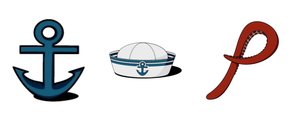
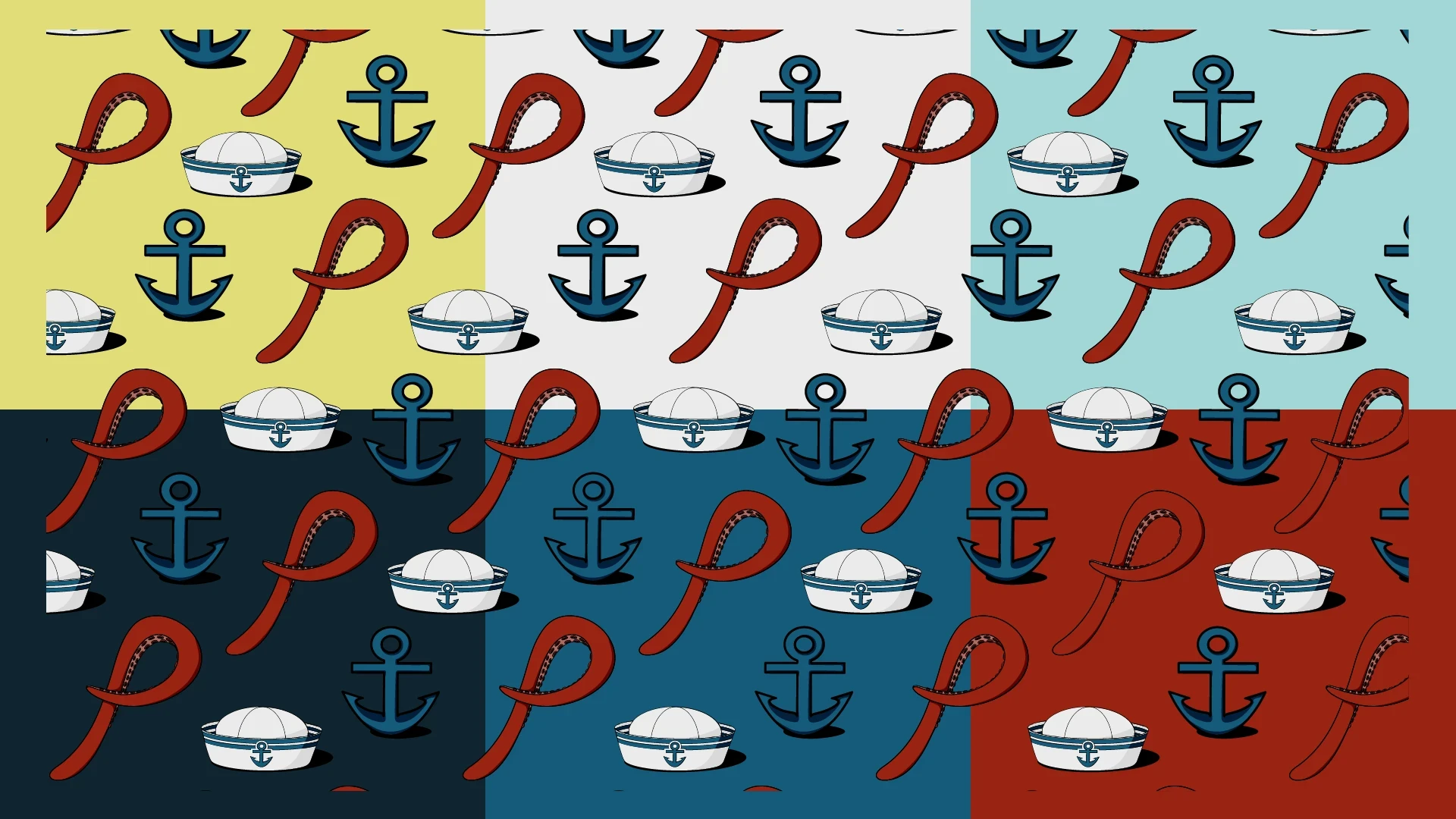
The anchor, sailor hat and tentacle-inspired P extend the coastal character beyond the main logo. Together, they form a repeating pattern for the restaurant identity.
A restaurant identity system
The wordmark, octopus character, tentacle-inspired P, anchor and sailor hat form a family of elements that can be used together or individually. The business-card mockups and repeating pattern show how the concept extends beyond a single logo. Polpo is presented as a restaurant branding concept, with the applications illustrating the proposed visual direction.
Explore related services
Have a project
in mind?
Whether you’re building a new brand, refreshing an existing identity or looking for original creative work, I’d love to hear about it.